Responsive web design is a method for developing websites so that they adapt seamlessly to various screens and other device types. Instead of creating distinct versions of the site for mobile and desktop users, the approach uses elements such as flexible layouts, CSS media queries, and scalable images to make sure the website looks and is well on any device. The agenda is to deliver an optimised user experience and consistent support, whether the site is viewed on devices such as a tablet, smartphone, laptop, or desktop.
Why does every website need a responsive web design?
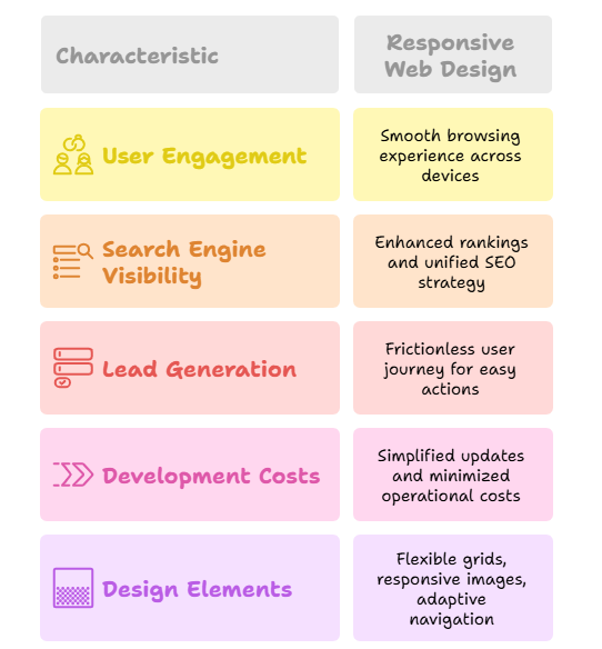
1. Better user engagement with various devices
Whether users are on desktop or smartphone, responsive website ensures they get a smooth experience with browsing encouraging them to stay longer and interact more. A significant practice is to run your website through mobile mobile-friendly test for quick insights.
2. High search engine visibility
Search engines help responsive websites with enhanced rankings. Moreover, a unified mobile-friendly website is easy to maintain and overall, an SEO strategy. A best practice is to improve your site speed by using structured headings that align with SEO strategies
3. Drives more leads and sales
A frictionless user journey makes it easy for visitors to act, whether it is about filling out the form or making a purchase. To illustrate, design touch-friendly buttons that help to drive more sales and leads.
4. Lower development and maintenance costs
Maintaining a single web design greatly simplifies updates and minimizes operational costs when compared to managing separate mobile or desktop versions. As a result, your team saves time, focuses on enhancing user experience, and reduces complexity. Therefore, to enhance the workflow, leverage CMS platforms for an enhanced responsive design out of the box.
Essential features of Responsive Web Design
Building a web design involves core elements such as:
Flexible grid system: Design layouts using relevant units that scale the device’s screen
Irresponsive images: Make images adjust automatically to fit the screen without any breakage of design.
Adaptive navigation: Ensure navigation elements remain consistent, accessible, and user-friendly for all devices.
Mobile first design: Begin designing for mobile devices, which enhances the experience for desktops.
CSS media queries: Use media queries to apply style changes based on various device characteristics.
Responsive web design elements
Responsive web design mistakes
- Displaying too much content on mobile, consequently lead to cluttered interfaces
- Failing to optimise for touchscreen interactions
- Using small fonts or cramped buttons, making mobile navigation difficult
- Not checking the site on real-world devices such as tablets and phones
- Including unnecessary content that slows down the performance on mobile
Why responsive web design drives business success?
The responsive web design is a smart move for any business to grow. Subsequently, the design supports your screens by using methods such as:
- Enhancing both user satisfaction and brand credibility
- Improving your site’s visibility on google
- Meet the high expectations of both mobile first and modern consumers
- Keep your brand aligned with evolving trends
- Enhance the effectiveness of your digital marketing efforts
Actionable tips for responsive web design
- Start with a mobile-first approach to ensure your website functions on small screens.
- Implementation of CSS media queries to adapt layouts dynamically and compress images to reduce load time.
- Advertise clear navigation and touch-friendly elements to create a smoother experience across all devices and screens.
Want to take the next step towards a future-proof website?
Empower your brand with Webtrex software services, the go-to web development company for modern web design and revenue-driven digital marketing services. From startups to enterprises, we provide digital marketing services, including e-commerce website solutions, web design services, and building websites to grow their own website.
An outdated layout will cost you credibility and customers. Whether launching a new site or defining an existing one, responsible design is essential. Optimize your website design or partner with a pro for a full responsive upgrade.
Keywords
Responsive, Web, design, website, Seo, Performance, development, Responsive web design
Relevant Articles
Top Website Design Mistakes to Avoid When Building Your First Website